Raya Maps
Product Designer
2018 – 2019
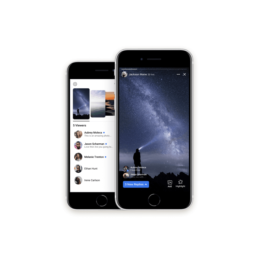
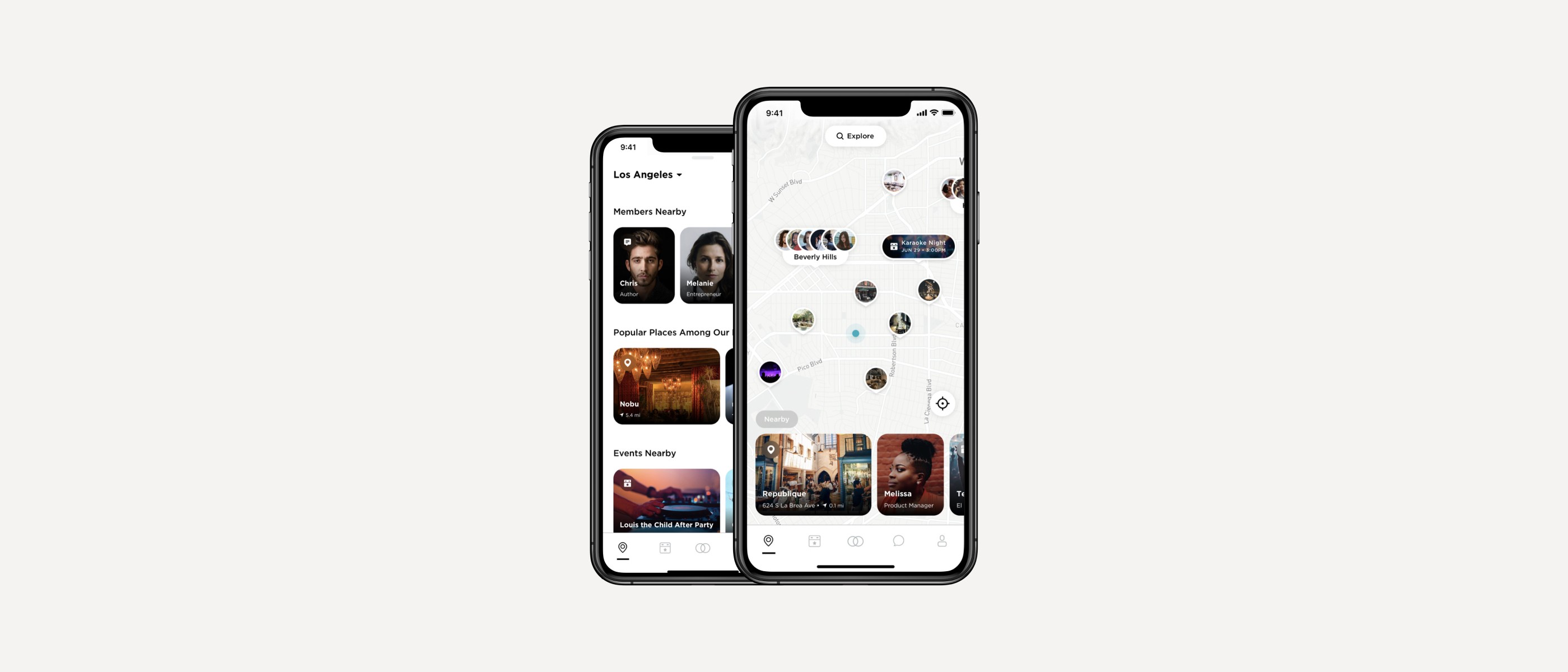
Since 2015, Raya has built a notoriously exclusive brand around “celebrity dating.” To continue growing in 2019, they had to adapt. As the youngest designer on the team, I helped Raya achieve its goal of transitioning brand and product beyond “celebrity dating” to encourage friending, business connections, and romantic connections in real life.
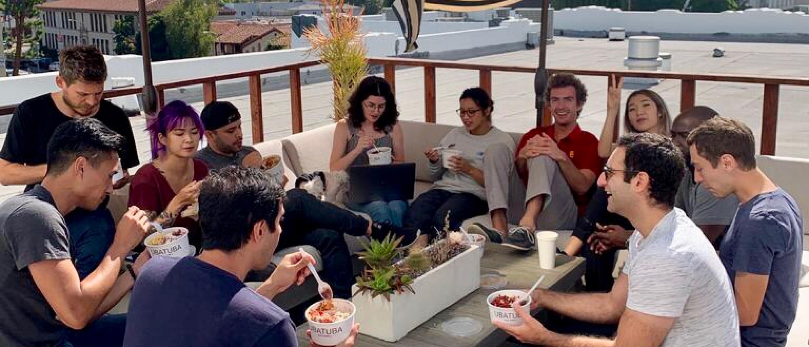
The Raya team, circa 2019.
Objective
My first project at Raya was to redesign Maps.
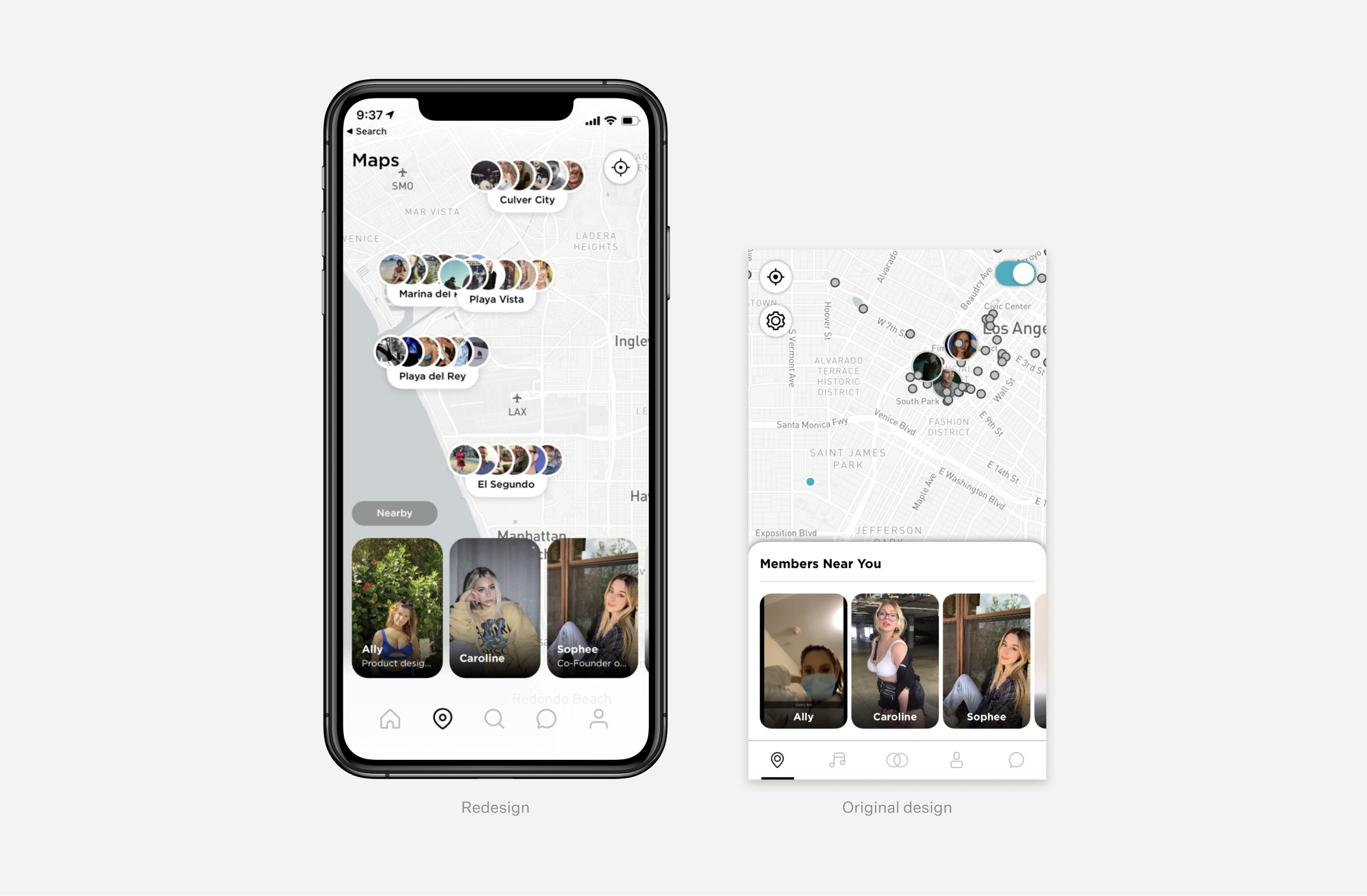
In 2019 Raya had a decline in Maps usage. Meanwhile, Raya’s new features—Events, Status, Highlights, and Direct Requests—were not included on Raya Maps. It was time for a redesign.
Audience
With members ranging from John Mayer to Olivia Rodrigo, Raya’s community is one of the most intimate and exclusive in the world—it could never exist without trust. That’s why, when I set out to redesign Raya Maps, trust and privacy were top of mind.

Some of the celebrity members on Raya.
Competitive Research
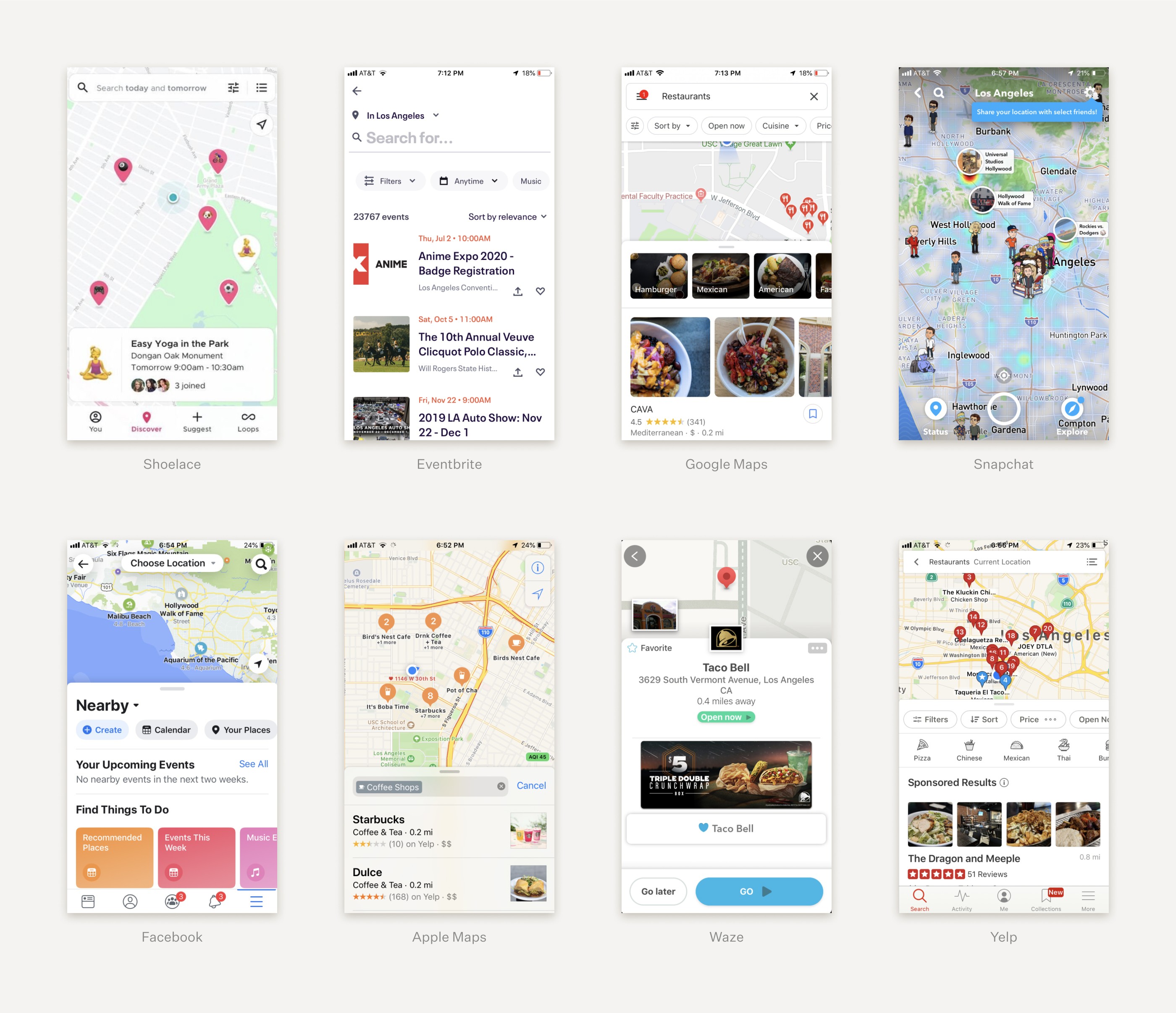
As the saying goes, we stand on the shoulders of giants. I studied dozens of popular map apps to get a better feel for what worked... and what didn't.
User Interviews
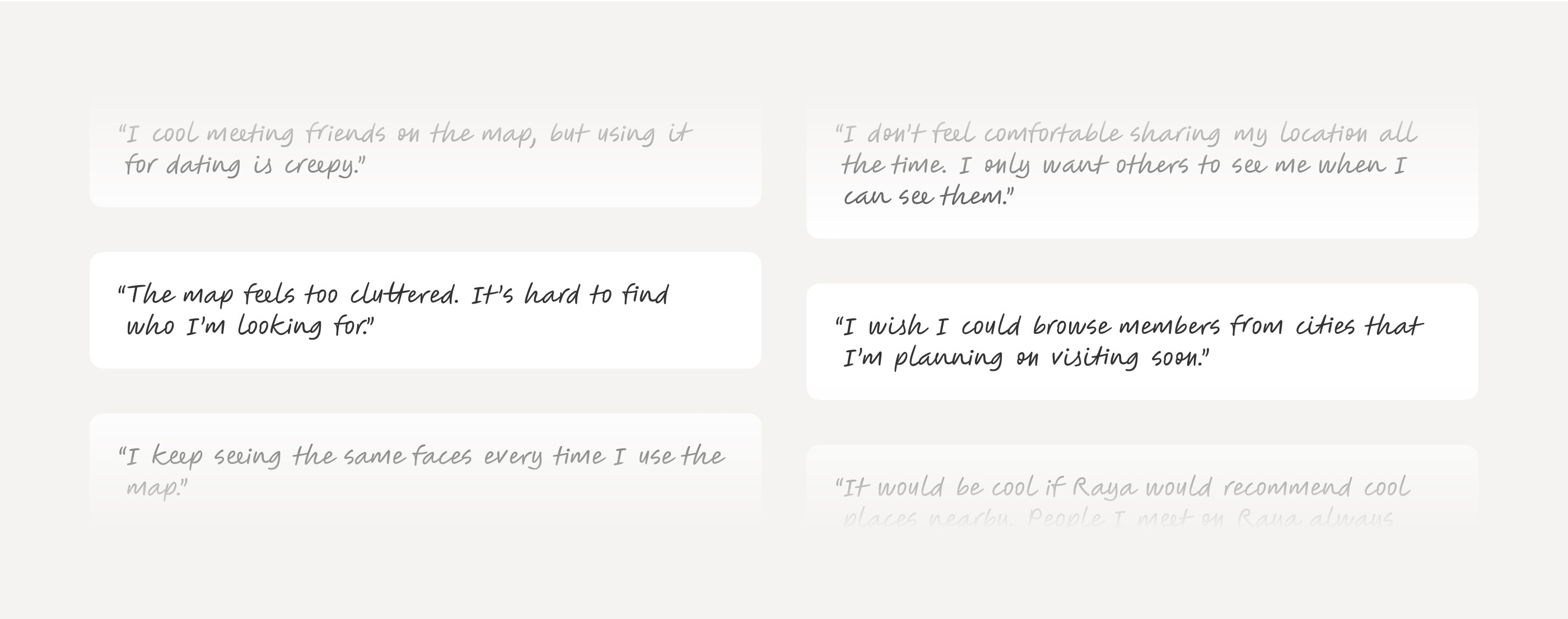
Talking with customers reinforced some of our assumptions, and challenged others. We gained new insights that became the north star of my design process.
Ideation
After aligning with the team about customer and product priorities, I moved on to the next step in my process—ideation. Sketching and brainstorming helped me rapidly visualize as many different ideas as possible.

Pivot!
Midway through ideation, Apple announced iOS 13, and with it, an update to its location privacy policy: Apps were no longer allowed to display users’ precise locations to other members without explicit consent. This meant that many of our initial ideas would no longer fly.
We returned to the drawing board, refocusing on our goal of facilitating spontaneous connections in real life. While we weren’t allowed to show members’ precise locations with iOS 13, we were allowed to show general locations. This constraint became the foundation of my redesign.
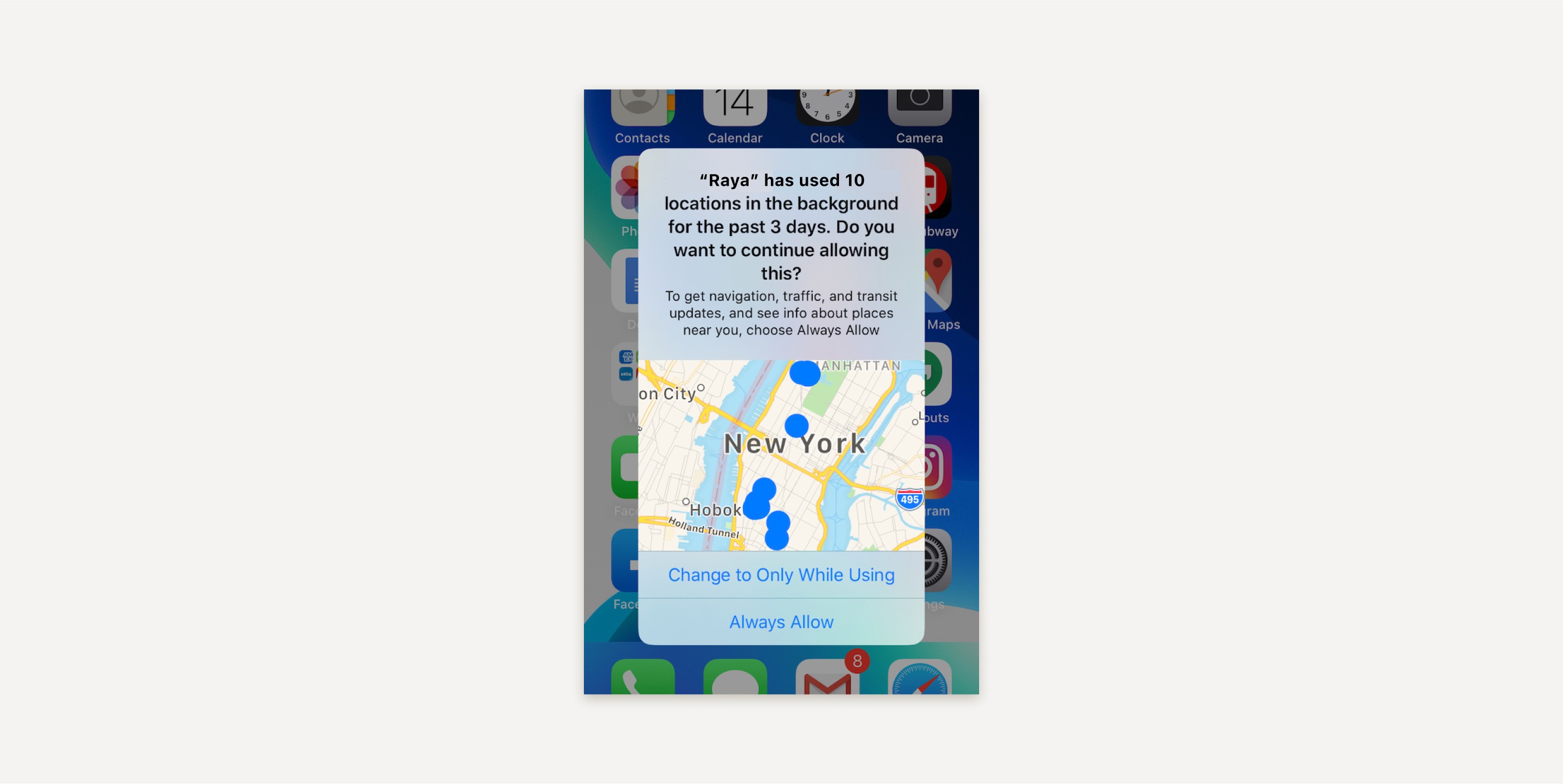
New location policy on iOS 13.
Iterations
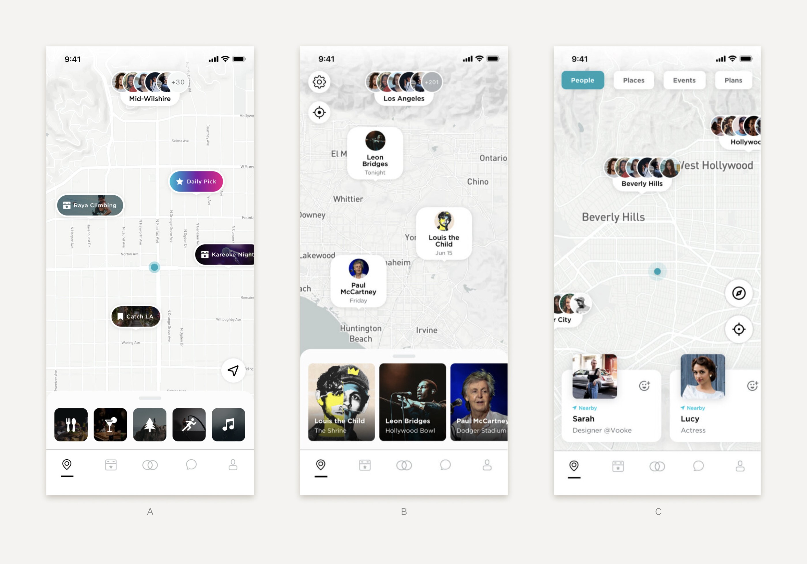
With the constraints of iOS 13 in mind, I explored new versions of the map that prioritized event and location discovery over people discovery. During testing, however, members made it clear that they still cared most about discovering people, not events or places. So we moved forward with direction C, which put people discovery front-and-center.
Final Design
Balancing customer, business, and tech priorities, my redesign breathed new life into a struggling feature. Today, Raya Maps helps its members connect IRL like never before.

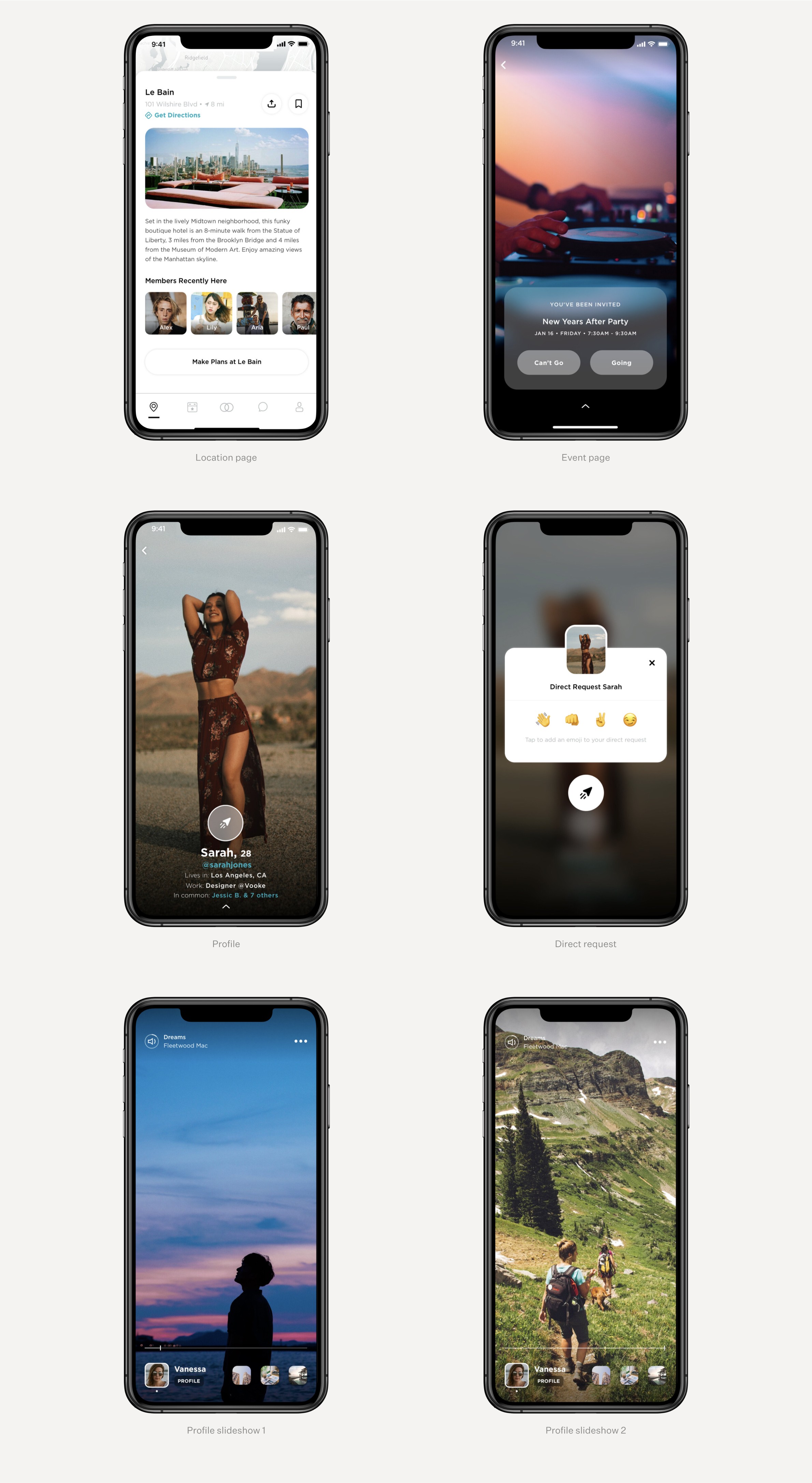
High Fidelity Prototype
The app interface came together quickly with core flows already in place. I built a high-fidelity prototype to visualize important gestures and animations for the engineering team.
Takeaways
Raya was my first full-time product design role. It’s safe to say I learned A LOT. With the help of an incredible design manager, Kevin Rosal, I leveled-up my design skills across the board—user research, wire-framing, prototyping, visual design, animation, and copywriting.
Both in building a simple product and an exclusive brand, less is more. I learned to approach my work with intentionality and simplify my designs as much as possible. These values are still core to my process today.

Raya Maps
Product Designer
2018 – 2019
Since 2015, Raya has built a notoriously exclusive brand around “celebrity dating.” To continue growing in 2019, they had to adapt. As the youngest designer on the team, I helped Raya achieve its goal of transitioning brand and product beyond “celebrity dating” to encourage friending, business connections, and romantic connections in real life.

The Raya team, circa 2019.
Objective
My first project at Raya was to redesign Maps.
In 2019 Raya had a decline in Maps usage. Meanwhile, Raya’s new features—Events, Status, Highlights, and Direct Requests—were not included on Raya Maps. It was time for a redesign.

Audience
With members ranging from John Mayer to Olivia Rodrigo, Raya’s community is one of the most intimate and exclusive in the world—it could never exist without trust. That’s why, when I set out to redesign Raya Maps, trust and privacy were top of mind.

Some of the celebrity members on Raya.
Competitive Research
As the saying goes, we stand on the shoulders of giants. I studied dozens of popular map apps to get a better feel for what worked... and what didn't.

User Interviews
Talking with customers reinforced some of our assumptions, and challenged others. We gained new insights that became the north star of my design process.

Ideation
After aligning with the team about customer and product priorities, I moved on to the next step in my process—ideation. Sketching and brainstorming helped me rapidly visualize as many different ideas as possible.

Pivot!
Midway through ideation, Apple announced iOS 13, and with it, an update to its location privacy policy: Apps were no longer allowed to display users’ precise locations to other members without explicit consent. This meant that many of our initial ideas would no longer fly.
We returned to the drawing board, refocusing on our goal of facilitating spontaneous connections in real life. While we weren’t allowed to show members’ precise locations with iOS 13, we were allowed to show general locations. This constraint became the foundation of my redesign.

New location policy on iOS 13.
Iterations
With the constraints of iOS 13 in mind, I explored new versions of the map that prioritized event and location discovery over people discovery. During testing, however, members made it clear that they still cared most about discovering people, not events or places. So we moved forward with direction C, which put people discovery front-and-center.

Final Design
Balancing customer, business, and tech priorities, my redesign breathed new life into a struggling feature. Today, Raya Maps helps its members connect IRL like never before.


High Fidelity Prototype
The app interface came together quickly with core flows already in place. I built a high-fidelity prototype to visualize important gestures and animations for the engineering team.
Takeaways
Raya was my first full-time product design role. It’s safe to say I learned A LOT. With the help of an incredible design manager, Kevin Rosal, I leveled-up my design skills across the board—user research, wire-framing, prototyping, visual design, animation, and copywriting.
Both in building a simple product and an exclusive brand, less is more. I learned to approach my work with intentionality and simplify my designs as much as possible. These values are still core to my process today.
Next Project
Next Project
