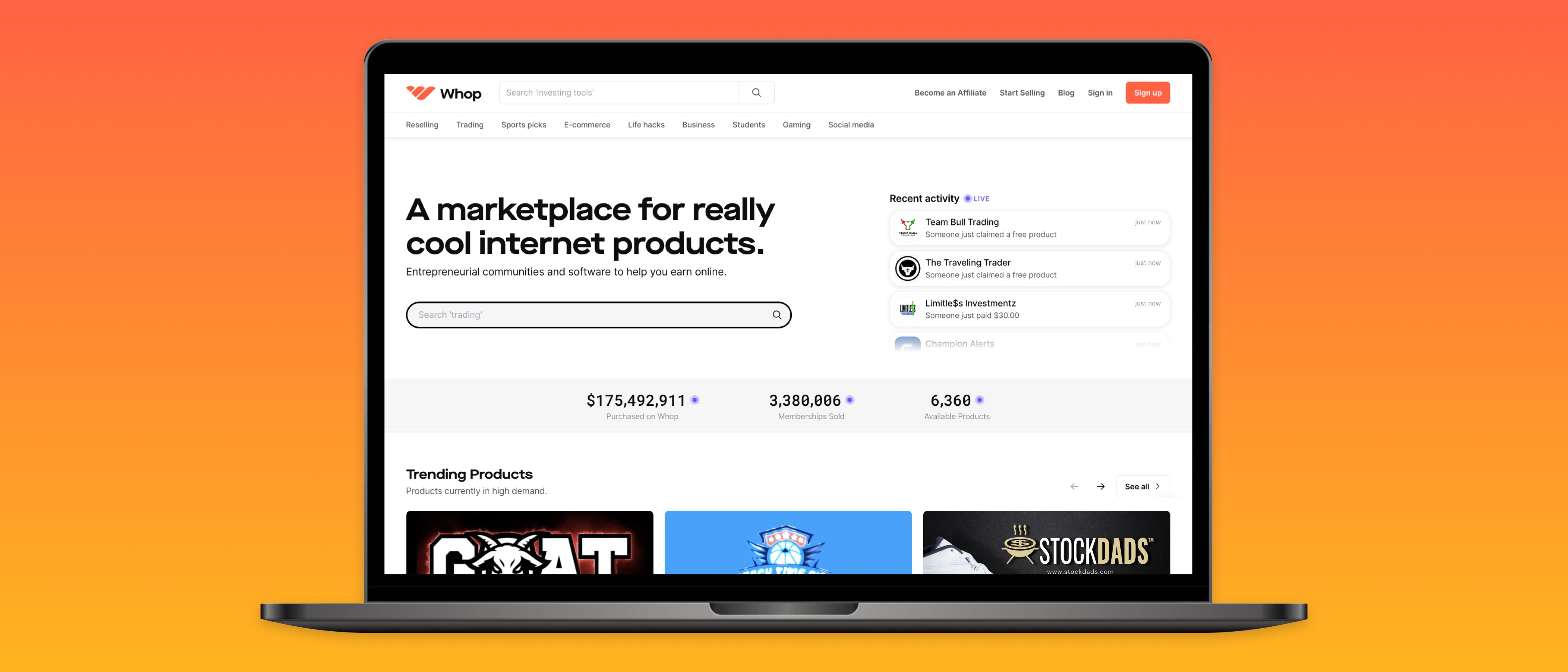
Whop.com
Founding Product Designer
2021 – 2023
I spent two years in Brooklyn, NY working alongside the talented folks at Whop. We built many things including an all-in-one platform for internet entrepreneurs to run their businesses, a no-code site editor, and a marketplace for some of the internet's hottest digital products.
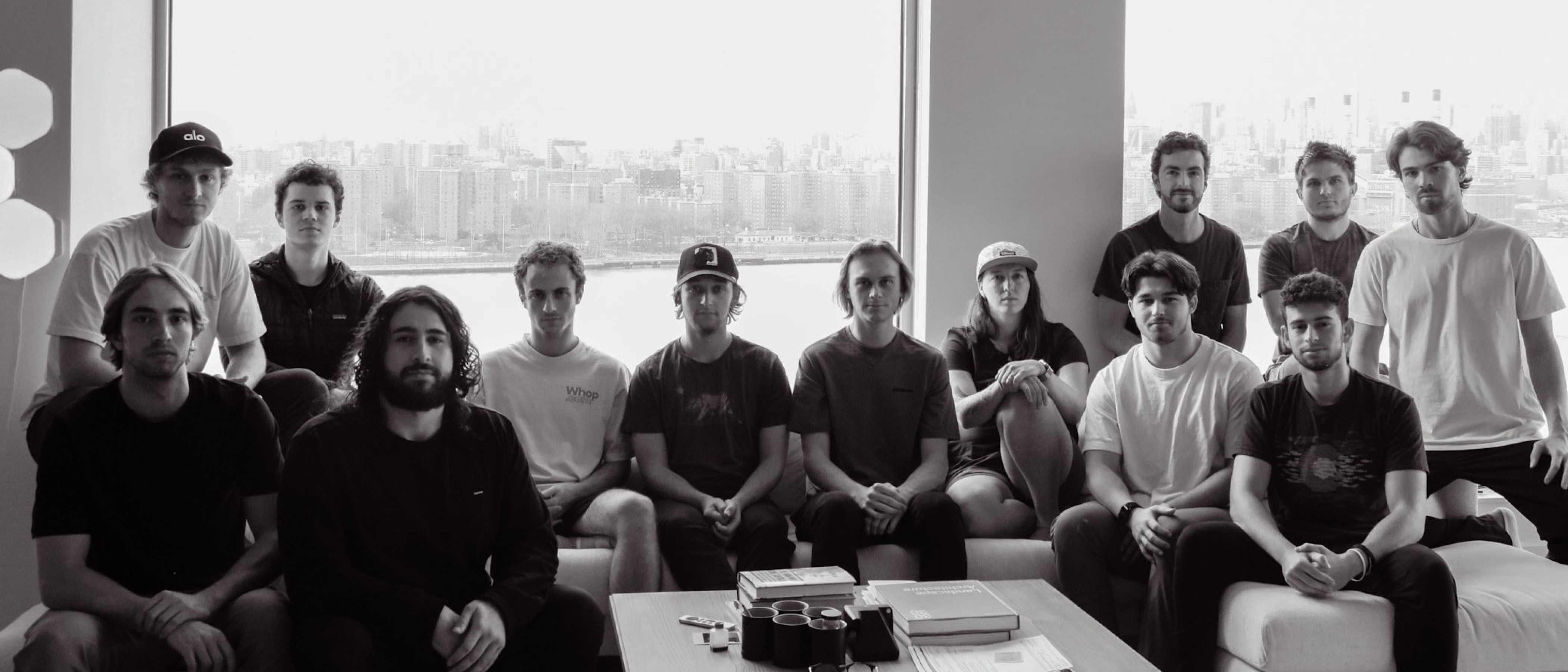
The Whop Mafia.
Whop Marketplace
Shopping for digital products online sucks. It’s a fragmented, sketchy experience. Our goal for Whop Marketplace was to create a one-stop-shop for people to easily discover, purchase, and manage their digital products.
We designed, built, and shipped the first version of Whop Marketplace within 3 months, then iterated for 6 months while conducting rapid cycles of user tests and interviews.
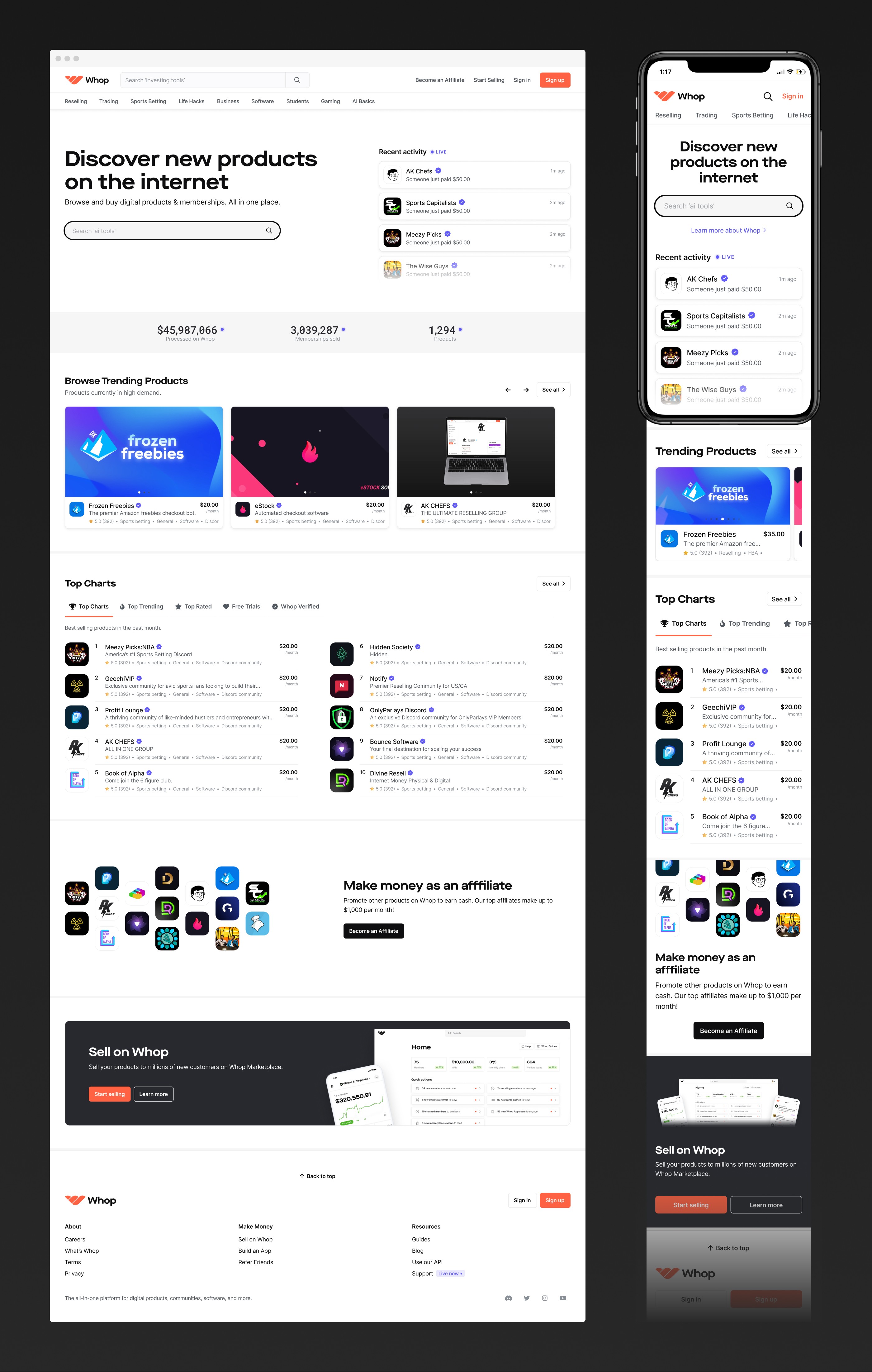
Product Page
We started by designing a new storefront template that could be customized easily by both beginner and pro sellers alike. The design was driven by months of feedback, market research, and A/B test results. Our primary objectives were to simplify product offerings, increase usability (especially on mobile), elevate sellers’ brands, and of course, convert more customers.
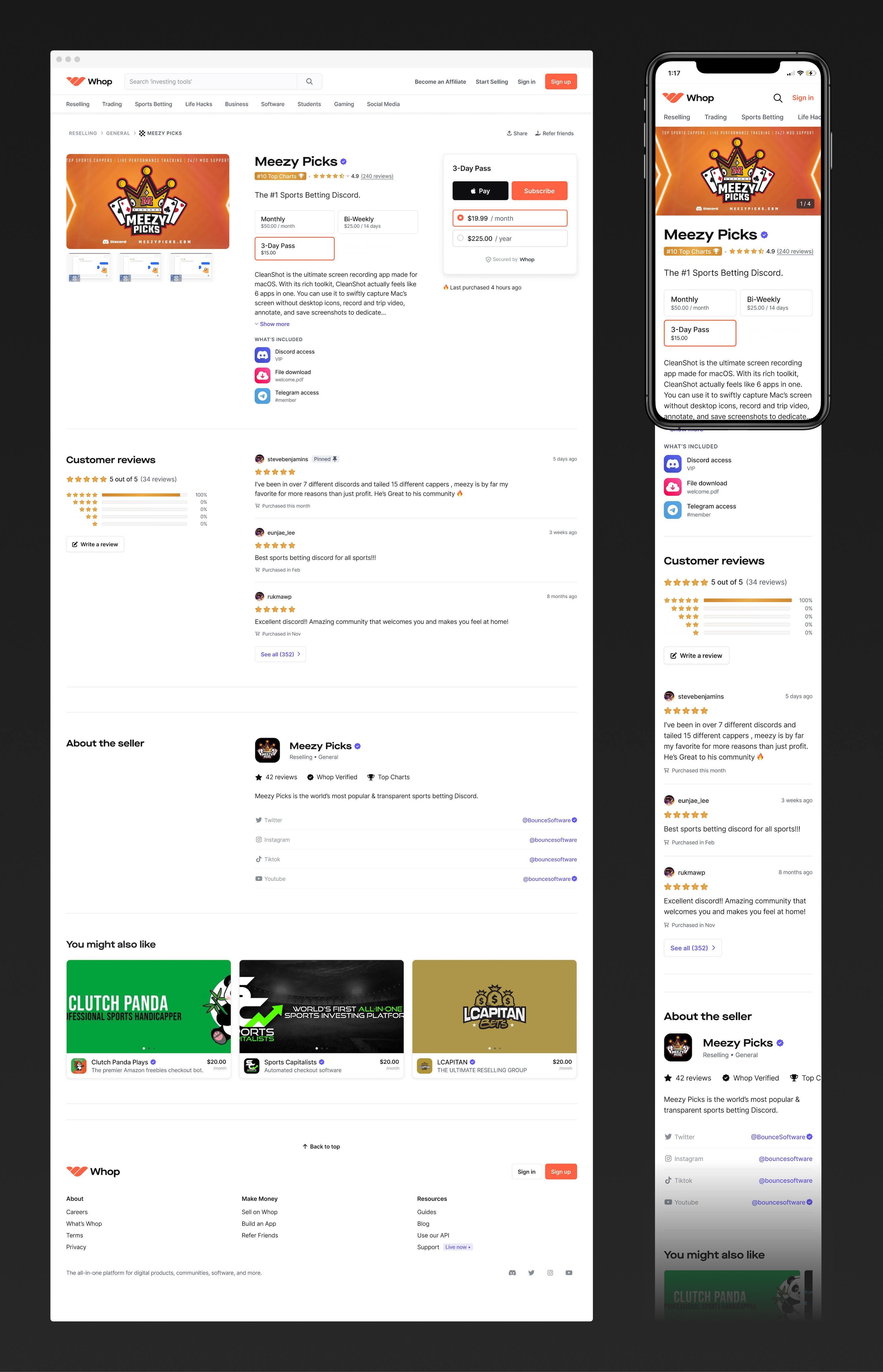
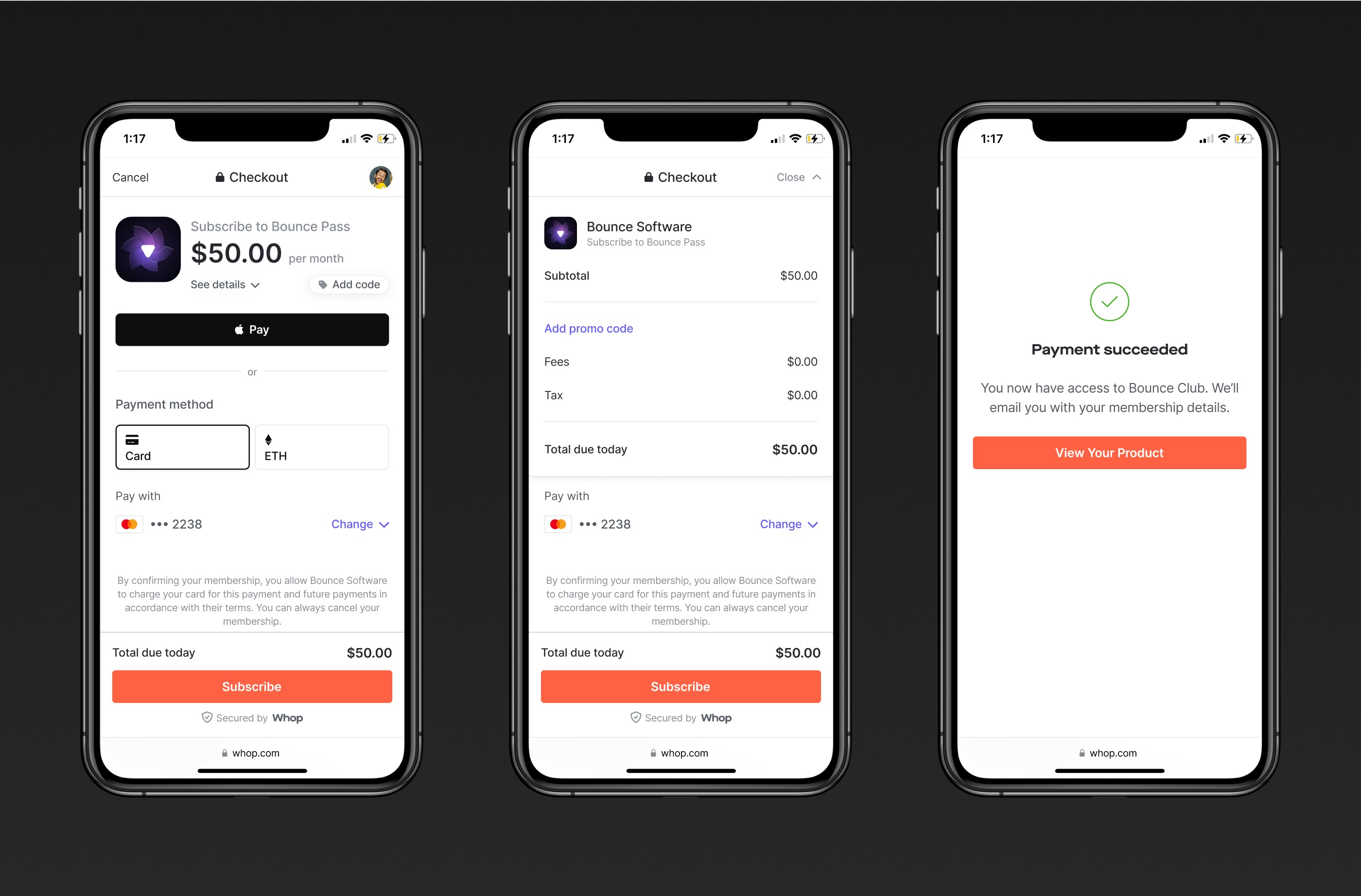
Checkout
Riding on the heels of the product page success, we tackled the checkout flow next. With (literally) thousands of permutations, this design required a robust system of components and variants. Thankfully, this project coincided with Figma's release of Variables. Phew!
Results Page
After our initial marketplace launch, a pattern began to emerge—customers liked to shop with a particular category in mind. We modified the results page and site navigation to reflect these customer preferences.
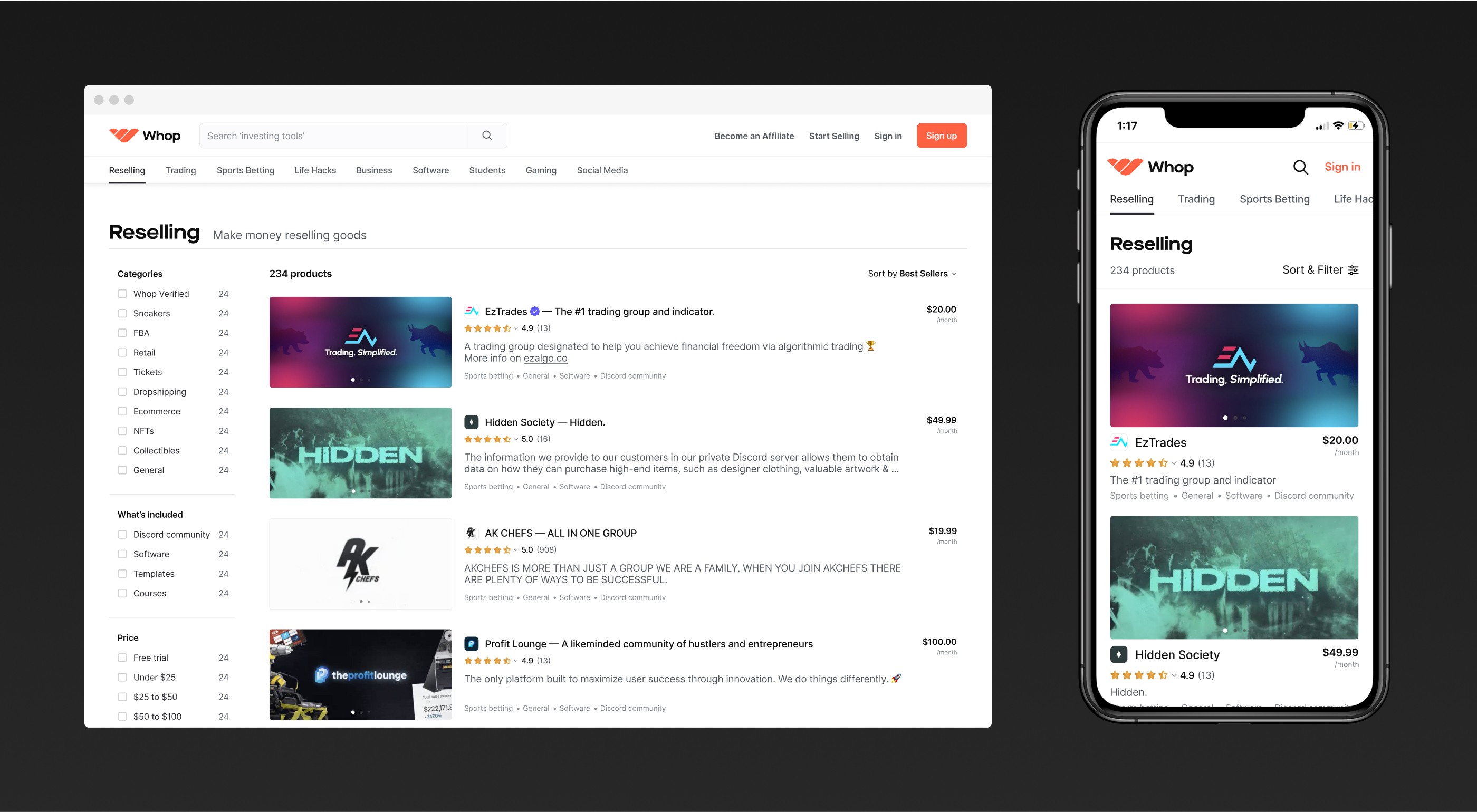
Experimentation
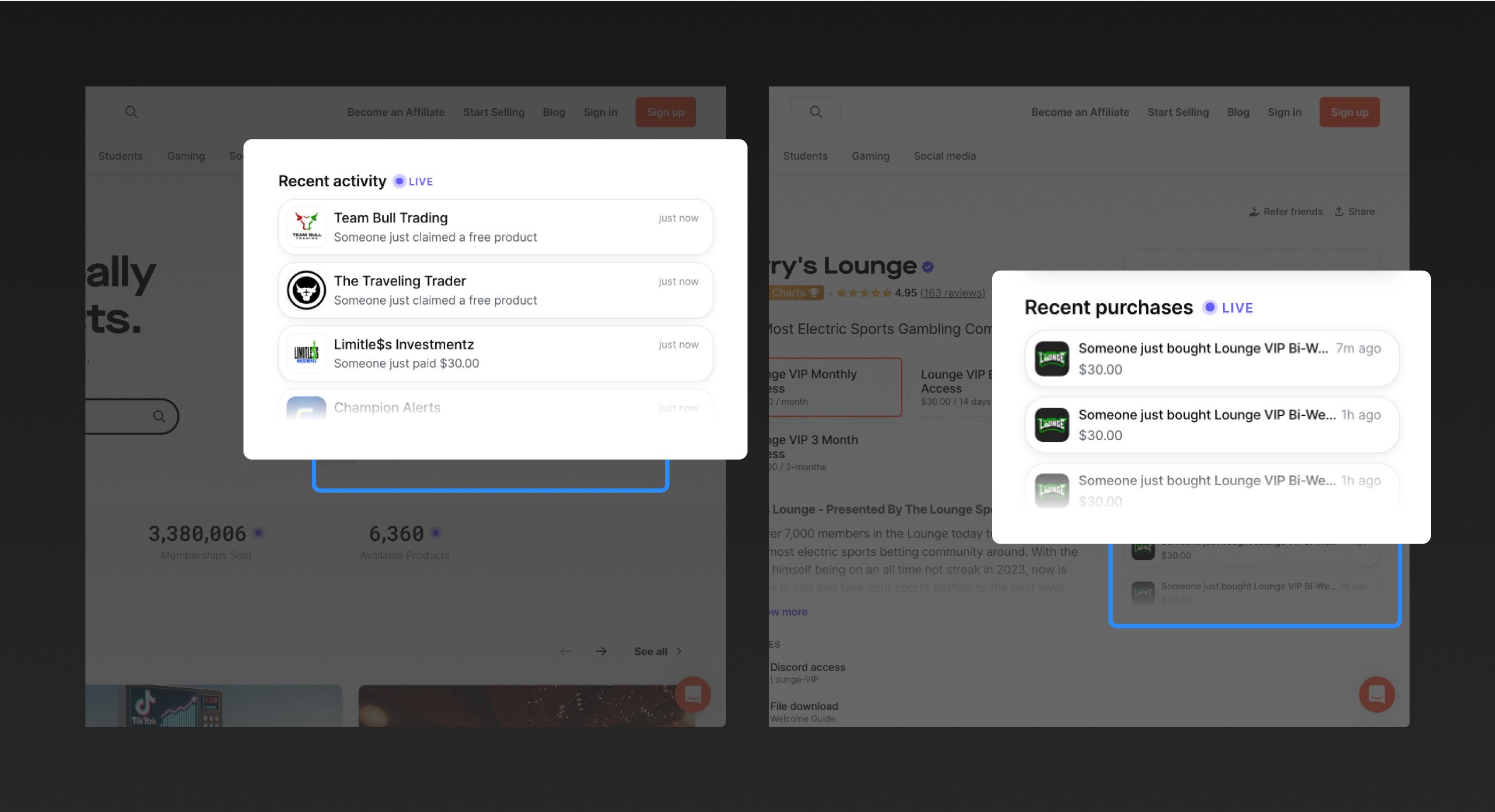
Working late at the office one night, we brainstormed ways to increase marketplace purchases. I was reading “Hooked” at the time and had a hunch that social proof could encourage customers to purchase.
I quickly designed an MVP with one of our engineers and shipped it that night. To our surprise, the experiment led to a massive increase in marketplace purchases. Today, over 25% of purchases come from this feature.
Illustration
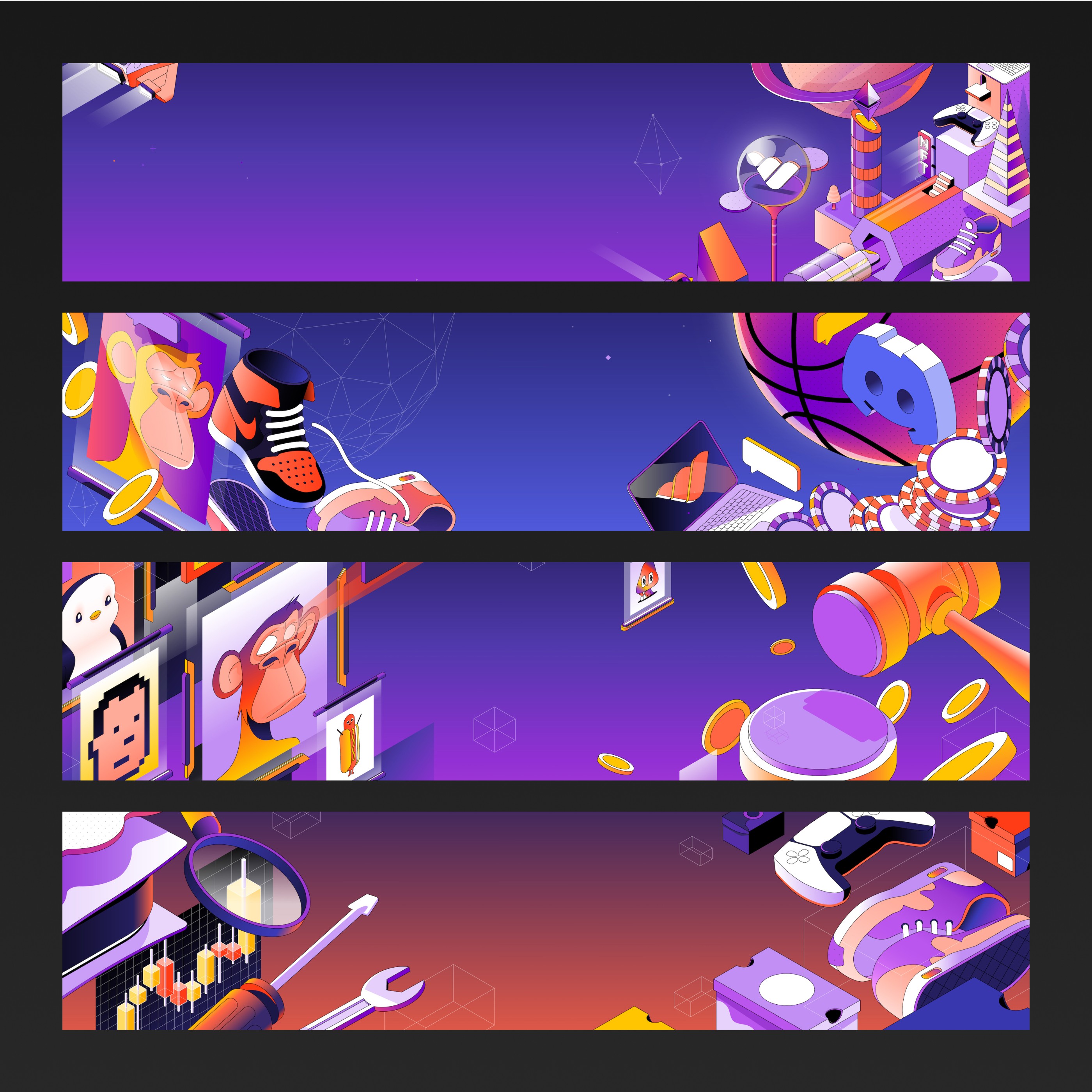
We hired the talented people at PinkYellow to create illustrations for our marketplace headers. They did an incredible job.
Over time, we moved away from using these illustrations on the site. Customers told us that they felt very "crypto-y," which was not our focus at the time.
Community
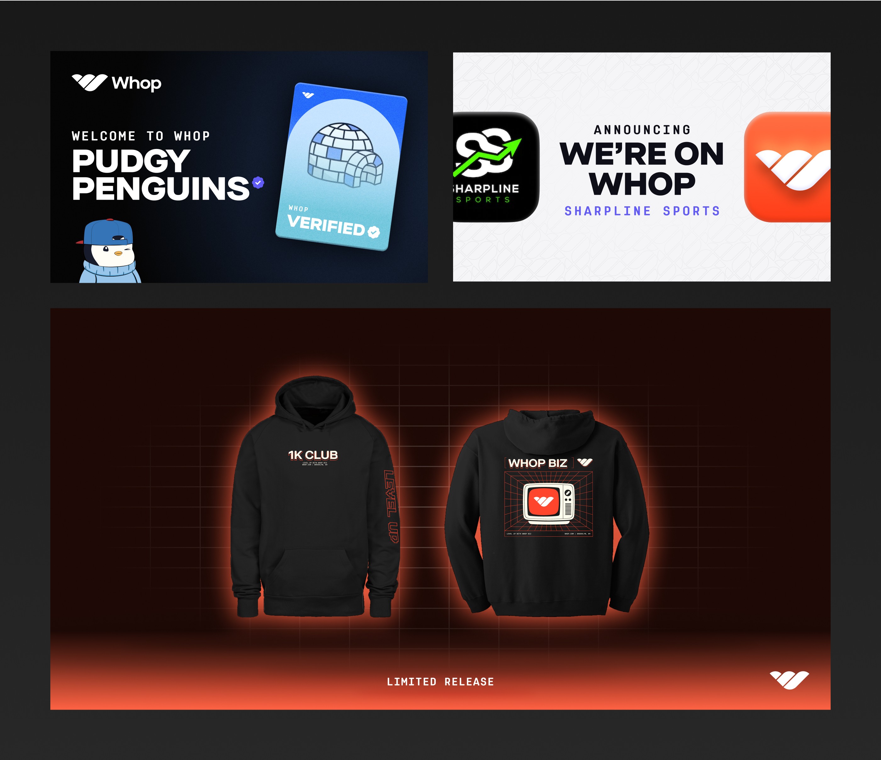
We gave serious thought to the ways we engage our community outside of our products.
I’m particularly proud of the seller milestone program we created, which rewarded sellers with handwritten letters, custom merch, and other prizes as their businesses grew.
Design System
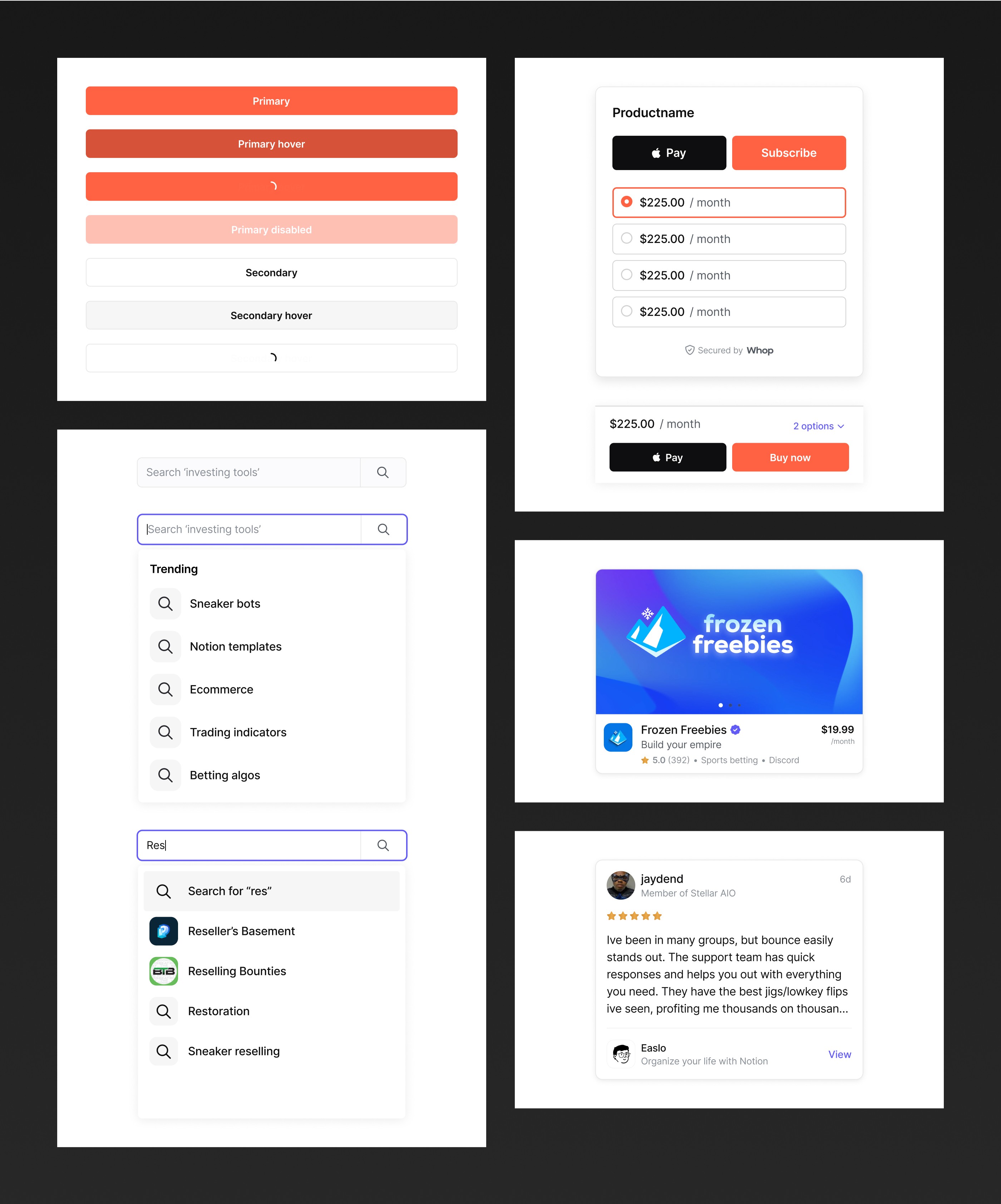
Soon after joining Whop, I began designing the Whop Design System. Our goal was simple—to create a more beautiful, consistent, and accessible design language. We built the WDS so that the components in Figma were identical in code, fully reusable, and compatible on different devices and sizes.
Today, the WDS is used by dozens of designers and engineers at Whop. You can see it in action on all of Whop’s web and mobile apps.
KPIs
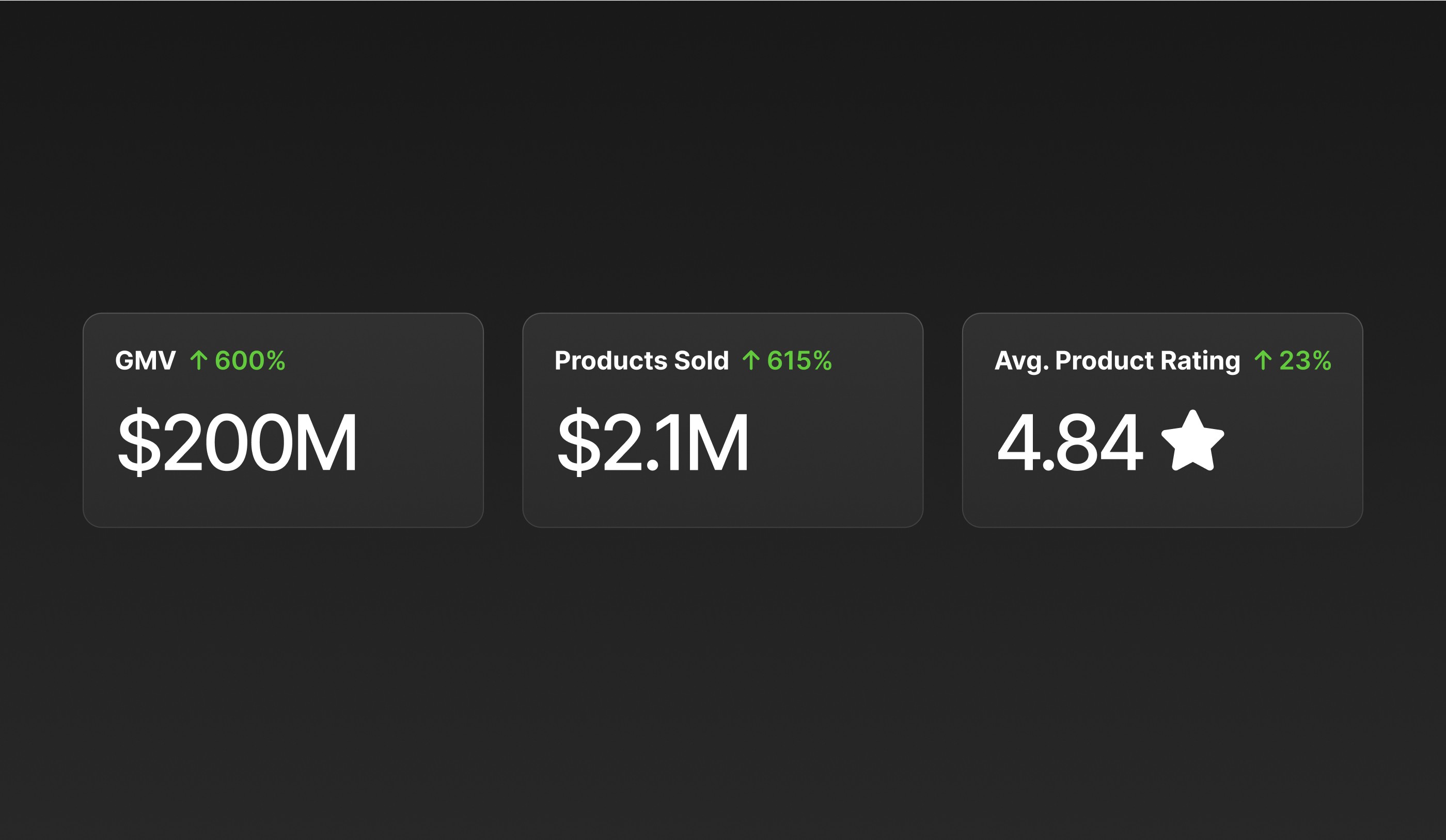
We measured our success by the success of our users. 6 months after launching Whop Marketplace, customers were purchasing more and canceling less. Sellers were making more money and receiving higher ratings.
Takeaways
Before joining Whop, I was a “measure twice, cut once” kind of designer. Working with a team of mostly engineers helped me to appreciate the benefits of shipping early and often. Mistakes are inevitable (and we made quite a few!). They key to our early success was how quickly we learned from our mistakes.
Above all, I learned that listening to customers and deeply understanding their problems is what allowed us to build a product people loved.

Whop.com
Founding Product Designer
2021 – 2023
I spent two years in Brooklyn, NY working alongside the talented folks at Whop. We built many things including an all-in-one platform for internet entrepreneurs to run their businesses, a no-code site editor, and a marketplace for some of the internet's hottest digital products.

The Whop Mafia.
Whop Marketplace
Shopping for digital products online sucks. It’s a fragmented, sketchy experience. Our goal for Whop Marketplace was to create a one-stop-shop for people to easily discover, purchase, and manage their digital products.
We designed, built, and shipped the first version of Whop Marketplace within 3 months, then iterated for 6 months while conducting rapid cycles of user tests and interviews.

Product Page
We started by designing a new storefront template that could be customized easily by both beginner and pro sellers alike. The design was driven by months of feedback, market research, and A/B test results. Our primary objectives were to simplify product offerings, increase usability (especially on mobile), elevate sellers’ brands, and of course, convert more customers.

Checkout
Riding on the heels of the product page success, we tackled the checkout flow next. With (literally) thousands of permutations, this design required a robust system of components and variants. Thankfully, this project coincided with Figma's release of Variables. Phew!

Results Page
After our initial marketplace launch, a pattern began to emerge—customers liked to shop with a particular category in mind. We modified the results page and site navigation to reflect these customer preferences.

Experimentation
Working late at the office one night, we brainstormed ways to increase marketplace purchases. I was reading “Hooked” at the time and had a hunch that social proof could encourage customers to purchase.
I quickly designed an MVP with one of our engineers and shipped it that night. To our surprise, the experiment led to a massive increase in marketplace purchases. Today, over 25% of purchases come from this feature.

Illustration
We hired the talented people at PinkYellow to create illustrations for our marketplace headers. They did an incredible job.
Over time, we moved away from using these illustrations on the site. Customers told us that they felt very "crypto-y," which was not our focus at the time.

Community
We gave serious thought to the ways we engage our community outside of our products.
I’m particularly proud of the seller milestone program we created, which rewarded sellers with handwritten letters, custom merch, and other prizes as their businesses grew.

Design System
Soon after joining Whop, I began designing the Whop Design System. Our goal was simple—to create a more beautiful, consistent, and accessible design language. We built the WDS so that the components in Figma were identical in code, fully reusable, and compatible on different devices and sizes.
Today, the WDS is used by dozens of designers and engineers at Whop. You can see it in action on all of Whop’s web and mobile apps.

KPIs
We measured our success by the success of our users. 6 months after launching Whop Marketplace, customers were purchasing more and canceling less. Sellers were making more money and receiving higher ratings.

Takeaways
Before joining Whop, I was a “measure twice, cut once” kind of designer. Working with a team of mostly engineers helped me to appreciate the benefits of shipping early and often. Mistakes are inevitable (and we made quite a few!). They key to our early success was how quickly we learned from our mistakes.
Above all, I learned that listening to customers and deeply understanding their problems is what allowed us to build a product people loved.
Next Project
Next Project


